Well, tomorrow’s the BIG day, folks — it’s MOVE IN DAY! Tonight will be the last night we sleep in this condo, and the last morning we wake up in these bedrooms, and the last morning we have tea in this kitchen. It’s bittersweet, but we’re reeeady to be done with this 2-month move in process. We’re ready to wake up every day and get started on fine-tuning, unpacking, decorating, and making the new dreamy headquarters all our own! ::squee eee eee eee eee!!!::
Darling Hotbuns is down with a lot of my retro/vintage flare(s), but he also likes to have new appliances and doodads that are modern, too. Therefore, we won’t be having an *entirely* retro/vintage house. ::smile:: It’s all about the compromise! Thankfully, DH & I do share very similar tastes (thank every deity, star, penny, & eyelash ever to exist, because it’s a beast when that is not so!). So our new digs will be a hodgepodge of contemporary & retro relics, as time goes by — not unlike the fantabulous assortment of photos I have shared with you all [below]. I’ve basically built a home, room-by-room, by scouting the Internet for eye-catching inspirations. Starting with…
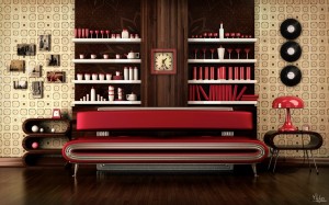
A retrotastic streamlined, high contrast living room in very well-thought-out retro touches, all in complimentary colors. The room is earthy, at one glance – with wood grains & subtle, basic hues – but then it pops by using bold color choices like red & stark white. ’50s inspired, yet still completely contemporary in it’s own way. To see more amazing stuff by this creator, check out the page of Hai Tharr.
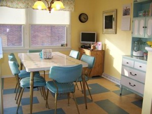
I LOVE this soothing, yet playful retro dining room, decorated in truly fabulous vintage pieces & collectibles! The downplayed color selection makes it cheery & airy without being overstated or dull. Because it is so superbly displayed, having those modern touches & conveniences does not distract from the integrity of the era. This is such a keen demonstration of someone taking the time to find the right elements and pulling them all together with flooring and wall paint, yet not making it flashy or spending an arm and a leg on design. I found this photo on Teresa’s Family Cleaning‘s website, which is retro-ly peachy clean, Jellybeans! I’d check ’em out if you live in that area. 🙂
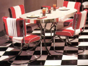
On the same note… I will never quit having a mad crush on all sorts of ’50s dinette sets; and in my case, the bolder the better! Our entire kitchen in the new digs is “Gumball Red”. There’s nothing quite like classic checkerboard flooring with a glittery, red, chromed out dinette to make a dining room feel like it should have a jukebox and all meals should be dished out with love…… on roller skates!
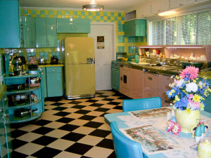
Take this absolutely DELICIOUS kitchen, for example… Good heavens to Betsy, kittens, this kitchen it so kitschy I could bake cupcakes a mile high because I’d never want to leave it! There are so many ways to decorate a modern kitchen with vintage objet d’art, but it is nothing but swoony if you go so far as to furnish EVERYTHING in appliances and materials FROM the era, authentically. This color palette is to die for! I want to roll all over the floor like a field of Heather & dance on the countertops like Elvis’ famous pelvis!
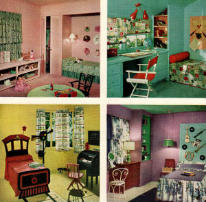
… And sticking with that same 1950s color scheme, here are 4 fine photographs of some really swell children’s bedrooms. 🙂 I love how adorable they are – all themed out to a child’s personal interests or personalities – but they are not overstocked with stray items everywhere. The 1950s were all about keeping surplus stuff contained/displayed neatly in toy chests & built-in shelving, while not compromising the fact that children were children. These were very hot colors for Sherwin Williams many decades ago (and I still fancy them something silly!). Our new abode has each of these colors in it! This was from Sherwin Williams Home Decorator in 1959.

There are quite a few things I would change about this retro, beachy master bedroom, but I had a hard time finding one that stayed true to the era, completely, and didn’t look like Tom Jones & Fear and Loathing in Las Vegas got drunk together and threw up on the fuzzy, shag carpet. As much as I like color that smacks you in the face like a cold shower, I prefer more docile colors in the bedroom. I like my bedroom to be more of a sanctuary away from my chipper, chirpy life that takes place outside of it. This room’s cool shades would be restful and serene after a lively day.
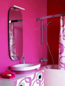
When it comes to bathrooms, I truly do love a full-fledged retro bathroom with black & white octagon-shaped floor tiling & a claw footed tub, but I can really appreciate these completely newfangled mod bathrooms in a retro chic. I’m all about the Mimo! Check out more Mimo designs at Plushemisphere!
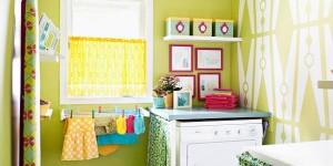
This is the first time in my life that I’ll have a bona fide LAUNDRY ROOM that’s not in a hallway closet, a garage, or a basement! I am really jazzed about this! I want to make it suuuper bright & happy because mountains of laundry can be quite depressing. ::smirk:: I lovelovelove the clothespin pattern on the accent wall! Remodelaholic has all kinds of sparkletacular laundry room designs that are just as swell, if you’re interested. 🙂
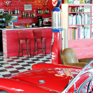
But wait…! What about your garage? They don’t have to be *just* for your Craftsman toolboxes & yard equipment – it can be another fun hot spot for the fam, too! You can fill it with all your fun relics that might not make sense inSIDE the house. And no, garages are not just “Man Caves” anymore, Mavs… Everyone needs a workbench & a cold one of their own! However, this is not actually a real garage – this is actually a restaurant in Paris! How would you like to eat baguettes & foie gras at that spiffy barista bar?! Astuce: Je le ferais, je le ferais! Moi, moi!
Keep calm & DECORATE on, Dollfaces! T.G.I.F.!
~ Angelika Frangelico *Gros bisous*
 <—- Speaking of garages, here I am in my uncle’s garage this summer. Wanna take a joyride?


I really enjoyed this post Heather. Great pictures. I look forward to seeing the final results melding modern and contemporary. Congratulations again on your new home.